Tuesday, June 13, 2006
Changing the looks!!
Well I am trying to change the blog appearance, so kindly bear with the intermittent problems like the font color. I am in the process of changing it, but due to some problem I have lost the connection with blogger :-(.
Will be able to bring back the blog into a readable form by tommorrow :-).
Tuesday, June 13, 2006
Changing the looks!!
Hello Everyone!!
Well I am trying to change the blog appearance, so kindly bear with the intermittent problems like the font color. I am in the process of changing it, but due to some problem I have lost the connection with blogger :-(.
Will be able to bring back the blog into a readable form by tommorrow :-).
Posted by
kosha
at
6/13/2006 05:25:00 AM
![]()
Labels: ramblings
10 comments:
- Mohan Kodali said...
-
I still say u reconsider ur setting the background. make the text scroll while the background remains constant. It luks really nice.
btw the word for verification is login
first time i have ever seen some meaningful word for verification. -
5:29 AM

- Mohan Kodali said...
-
btw nice background.
-
5:30 AM

- Prasoon said...
-
aha.. set the text colors right else it wouldn't be readable// rest all seems fine n try n incorporate chandu's idea - it'd be better :)
-
10:13 AM

- Raja said...
-
nice changes. looks really cool. but, set the background image as 'fixed'
-
11:37 AM

- kosha said...
-
Hey chandu...
there was actually some problem previously...thts y i was not able to make it fixed...but now i found the solution to it...and i have made it mixed :)
the word verification "login" was really surprising!!
@prasoon
m in a fix...m not able to edit my previous posts from my office network...so will have to do it this weekend :(
@raja
thanx >:D<
i have set the background to no-repeat... -
11:27 PM

- kosha said...
-
*fixed
-
11:28 PM

- Raja said...
-
ok, now align the background pic to top and middle, and set a background color that matches the pic
and remove the word verification -
9:38 AM

- Bloggie said...
-
This look is good. I like the background pic esp.
-
1:41 AM

- kosha said...
-
@raja
m not going to do it...
@sharat
thanx :) -
1:37 AM

- Proteus said...
-
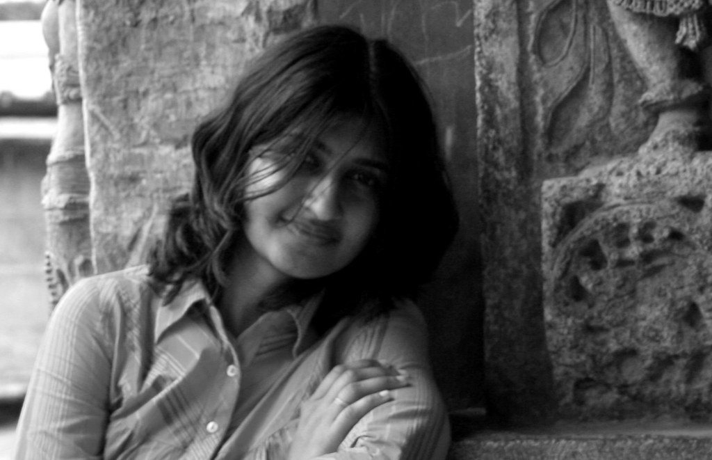
Can we please go with a background that improves readability? The image is cool...try increasing contrast, and apply wash filter to it.
-
11:50 PM


10 comments:
I still say u reconsider ur setting the background. make the text scroll while the background remains constant. It luks really nice.
btw the word for verification is login
first time i have ever seen some meaningful word for verification.
btw nice background.
aha.. set the text colors right else it wouldn't be readable// rest all seems fine n try n incorporate chandu's idea - it'd be better :)
nice changes. looks really cool. but, set the background image as 'fixed'
Hey chandu...
there was actually some problem previously...thts y i was not able to make it fixed...but now i found the solution to it...and i have made it mixed :)
the word verification "login" was really surprising!!
@prasoon
m in a fix...m not able to edit my previous posts from my office network...so will have to do it this weekend :(
@raja
thanx >:D<
i have set the background to no-repeat...
*fixed
ok, now align the background pic to top and middle, and set a background color that matches the pic
and remove the word verification
This look is good. I like the background pic esp.
@raja
m not going to do it...
@sharat
thanx :)
Can we please go with a background that improves readability? The image is cool...try increasing contrast, and apply wash filter to it.
Post a Comment